Tuesday, 27 November 2012
Journal Day 10
After sitting through a morning of make up, we was ready to shoot. Shooting went well, there was a little bit of struggling at the beginning due to a distributive group of people in another class, but they got bored and left. We spent a lot of time using different lighting to get a variety of shots. These shots are me in costume in front of the green screen, some of these unfortunately came out too dark to use in edit, but we had so many that we will still be fine in the editing stage. The shots with Manuel all turned out great, the shot that took the longest was the "CCTV" camera shot. This was because we was working with two people, both of which was acting, and we was both in that scene.
Monday, 26 November 2012
Journal Day 9
Today we finalized details for tomorrow shoot, I went for a patch test and then went around college to borrow various items to make our costume, i.e, over-alls and aprons.
Thursday, 22 November 2012
Ident Essay
BBC Three
http://idents.tv/videos/newBBC3street.html
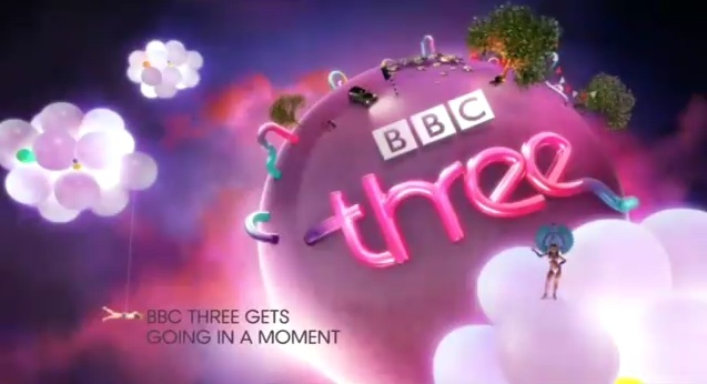
 The BBC Three ident started back in 2003, and started with idents revolving around a family of talking slugs. This was to establish that the channel was for a younger crowd, and was aiming for funny programming. They kept up with this programming, but decided to drop the slugs a few years back, they have gone with a more vibrant, colourful, more populated world. Each ident has so much happening in it, with the things we see, the people populating this world, and the weird and wonderful things that are happening in the foreground and background. The one I will use as an example is a car crash ident, which as a car hitting a fire hydrant, which then leaks a bright pink liquid, this then attracts a series of characters, such as a jogger, who all gather round the liquid to investigate. We also see quite bizarre things dotted around this little town, we see giant fire extinguisher, and a Tv, a lightbulb, and baubles hanging from the tree. This is all to paint a picture of a miniature city, or world, the characters themselves look like tiny people, and the strange items seen in the idents support this, we are looking at the world of the borrowers. The Three logo itself is always seen, and it seems to be treated as electricity, there is clearly some sort of voltage that runs through the Three, either that, or there is a liquid that runs through it, and the Three is a crazy straw. The Three isn't really centered, and it doesn't take attention away from the other things that are happening in the ident, but the colour still makes it stand out, and like I said, it is always present, so you will see it at some point and be reminded or told of the channel. The colours themselves also reminds you of the channel, the purple/pink, is used be BBC Three, and we always see those colours. We associate that colour with that channel, same with red for BBC One and yellow for ITV1. With quite a lot of things happening on screen and there being so much to see and point out on screen, the tempo is fast, the music is fast paced and loud, which works especially well on another BBC Three ident in which a flash dance breaks out. On the interaction with audience basis, there isn't much to go by, there is a voice over, informing the viewer what is coming up. There is also a "subtitles" notice at the top right of the screen at all times. The voice over is very friendly, and chummy, they talk to the audience rather than inform, this is to treat the viewer as a friend rather then the audience. With this concentration on treating the viewers like friends rather than viewers, the ident concentrates on the entertainment, rather than information. Like I said, it doesn't offer a lot of information. We know what channel it is, we know it offers subtitles, and due to voice over, we know what is coming up, but we are told more about the channel by its entertainment, for example, the colours that we see are the Three logos colours, so we already know what channel we are watching when we see those colours, we also see the characters that populate the world, which are very entertaining to watch. Each seem to have their personality, in this ident, we see a fussy jogger and a deep sea diver emerging from the water that came from the hydrant, examples like the diver also show how unpredictable and wacky this world is. BBC Three works quite differently to other channels, for example, the channel only starts broadcasting shows at 7 in the evening, and finishes at 4 in the morning, this time frame is quite strange for a channel to do, but it is owned by the BBC so doesn't need to be on 24/7 to advertise and keep sponsors happy, it also caters to a younger audience that only really tunes into television around that time, so they have no need to show shows earlier on in the day as no one would be watching, also, with it aiming for showing comedy for a younger audience, most of their shows will have to be shown after the watershed, as they will contain crude humour and strong language. Taking into account that Three only broadcasts shows for less than half a day, it still advertises itself really well, during the times that the channel is offline, it has a still that informs you of what channel you are on and what time it starts broadcasting...

...It also has BBC dominant at all times, so it isn't just the channel title that we are being reminded off, we are also reminded that Three belongs to BBC. The channel is also very fast paced and speedy due to it's target audience (who are thought to be constantly on the move, and who have short attention spans.) So the ads for the shows are very fast paced as well, they are snippits to inform and advertise new series and exclusive shows.
http://idents.tv/videos/newBBC3street.html

...It also has BBC dominant at all times, so it isn't just the channel title that we are being reminded off, we are also reminded that Three belongs to BBC. The channel is also very fast paced and speedy due to it's target audience (who are thought to be constantly on the move, and who have short attention spans.) So the ads for the shows are very fast paced as well, they are snippits to inform and advertise new series and exclusive shows.
Tuesday, 20 November 2012
Idents In More Detail
BBC One - "Consider Yourself..."
http://www.youtube.com/watch?v=loNQgax53Jk
 The biggest message that the BBC is trying to get across in this Ident is one of family. They show this by firstly, using the song they do, "Consider yourself, one of us. Consider yourself, part of the family" speaks for itself. Plus, they bring together a host of recognizable faces we see on the BBC a lot, such as the cast of EastEnders, the cast of Doctor Who, talk show hosts, and comics, and big names that have been around for a long time like David Jason, who we first see start singing this song. The environment that they use also support this family message, they are always shown in homes (except at the end) and because it is a christmas ident, the homes are decorated with a festive spirit, we see trees, baubles, tinsel and sweets, and all the cast are wearing festive knitted jumpers. This again shows the BBC in a good light, shows them as a "family" and for families. The shots that they choice are quite interesting as well, as they go for what we stereotypically think of with christmas and families, they are all gathered round a piano singing, this is something we are used to seeing in old christmas movies like "It's A Wonderful Life." It finished with the circle we are used to seeing with the BBC, it is there logo and seems to represent a unison in this instance, a unison a people of all ages, sexes and ethnicity's gather in a circle around this cast of familiar BBC faces to sing with them. This is the only time we see the BBC One logo as well, but with the cast of faces we always see on this channel, we always get the impression that we are watching BBC One.
The pace of the Ident works really well, the pace of the song is quite slow and we have characters singing it, so the shots last for a good few seconds, I think the shots would be longer if they were working with a smaller cast, they use the shots of the famous faces to show us a lot of christmas imagery, we have the cast wearing festive jumpers for a start, and they are interacting with each other using traditional things we associate with christmas, such as crackers, mistletoe, the christmas dinner, and games such as twister, again, this is all to give us that family feel about the channel.
The Ident is very welcoming, and appeals greatly to the audience, this is due to the famous faces, but mostly, it is the song itself, it almost beckons the audience to sing along with the cast, again, making them feel like "one of the family" We don't really get any information in the Ident, yeah we see a cast from shows on the BBC but we aren't told if any of those shows are on, or when, or what time, we are shown the channel logo and title, and we also hear the famous BBC One three bar theme, but that is it, this Ident is entirely entertainment-led.
More 4 - Really Quite Clever
http://idents.tv/videos/More4-ReallyQuiteClever.html
 The demographic for this channel comes across straight away while watching this Ident, the message itself is said, "Really Quite Clever" it is quite clear that the channel is aiming towards a more intelligent, crowd. So, they have Jon Snow, Tony Robinson, David Starkey and Kevin McCloud to act as "mascots" for the intellects, and for the channel.
These resident experts walk into a local bar to take part in a quiz night, this shows that More4 is going for a mixture of comedy and factual programs such as Time Team. The humour is quite subdued, at the beginning, the team of "experts" are seen to be feared, the dogs cower, and there is a guy who acts terrified (in a humorous way) when the team confirms that they are taking part in the quiz. The only joke that is set up is the last one in which the team of "experts" don't know a pop question.
It is that set up that allows the ident to introduce other "famous" faces seen on More4, such as Morgan Spurlock, whose career first started on the channel. The channel itself is only even shown for a matter of seconds, and only spoke once, as the experts are called the "More4 Team" This is very much like the BBC One - Consider Yourself Ident, in which the famous faces are meant to advertise the channel rather then them showing the title and logo itself, of course they still have to show the title and logo, but they never need to rely on it. Again, relating to the BBC One ident, this ident is solely for entertainment, the only bit of information we receive is the title itself, and also, a little bit about we programs we are expecting to see on the channel. "A Little Bit Clever" not only relates to the experts, but the programming schedules.
http://www.youtube.com/watch?v=loNQgax53Jk

The pace of the Ident works really well, the pace of the song is quite slow and we have characters singing it, so the shots last for a good few seconds, I think the shots would be longer if they were working with a smaller cast, they use the shots of the famous faces to show us a lot of christmas imagery, we have the cast wearing festive jumpers for a start, and they are interacting with each other using traditional things we associate with christmas, such as crackers, mistletoe, the christmas dinner, and games such as twister, again, this is all to give us that family feel about the channel.
The Ident is very welcoming, and appeals greatly to the audience, this is due to the famous faces, but mostly, it is the song itself, it almost beckons the audience to sing along with the cast, again, making them feel like "one of the family" We don't really get any information in the Ident, yeah we see a cast from shows on the BBC but we aren't told if any of those shows are on, or when, or what time, we are shown the channel logo and title, and we also hear the famous BBC One three bar theme, but that is it, this Ident is entirely entertainment-led.
More 4 - Really Quite Clever
http://idents.tv/videos/More4-ReallyQuiteClever.html

These resident experts walk into a local bar to take part in a quiz night, this shows that More4 is going for a mixture of comedy and factual programs such as Time Team. The humour is quite subdued, at the beginning, the team of "experts" are seen to be feared, the dogs cower, and there is a guy who acts terrified (in a humorous way) when the team confirms that they are taking part in the quiz. The only joke that is set up is the last one in which the team of "experts" don't know a pop question.
It is that set up that allows the ident to introduce other "famous" faces seen on More4, such as Morgan Spurlock, whose career first started on the channel. The channel itself is only even shown for a matter of seconds, and only spoke once, as the experts are called the "More4 Team" This is very much like the BBC One - Consider Yourself Ident, in which the famous faces are meant to advertise the channel rather then them showing the title and logo itself, of course they still have to show the title and logo, but they never need to rely on it. Again, relating to the BBC One ident, this ident is solely for entertainment, the only bit of information we receive is the title itself, and also, a little bit about we programs we are expecting to see on the channel. "A Little Bit Clever" not only relates to the experts, but the programming schedules.
Journal Day 8
Today we finalized a lot of details before we film next week. We visited hair and beauty to discuss dates they are available for make up, we planned it were I would get a patch test on Monday and then make up on Tuesday morning, ready for filming that afternoon.
Wednesday, 14 November 2012
Journal Day 7
Today I worked on the shots list, props list and storyboarding of two of my ideas.
Idea One:
S1. LS of the "warehouse" showing the main character and the television
S2. CU of the main character as he picks up the Tv remote.
S3. OTS shot of the main character flicking through the Tv channels, showing that only one character shows up on the Tv.
S4. BEV shot showing the CCTV footage of the main character sat there with the killer stood behind him.
Idea Three:
S1. Forward panning shot down a corridor
S2. The panning shot slowly comes around a corner to reveal a zombie
S3. Slow zoom of the zombie eating, it then turns around slowly
S4. CU of the "body" which is the feasted Film 4 logo.
My props list includes:
Idea One:
- Television (Inc remote control)
- Seating
- A mask (potato sack perhaps)
Idea Three:
- Prosthetics (zombie make-up)
- Fake blood
- Mannequin
Idea One:
S1. LS of the "warehouse" showing the main character and the television
S2. CU of the main character as he picks up the Tv remote.
S3. OTS shot of the main character flicking through the Tv channels, showing that only one character shows up on the Tv.
S4. BEV shot showing the CCTV footage of the main character sat there with the killer stood behind him.
Idea Three:
S1. Forward panning shot down a corridor
S2. The panning shot slowly comes around a corner to reveal a zombie
S3. Slow zoom of the zombie eating, it then turns around slowly
S4. CU of the "body" which is the feasted Film 4 logo.
My props list includes:
Idea One:
- Television (Inc remote control)
- Seating
- A mask (potato sack perhaps)
Idea Three:
- Prosthetics (zombie make-up)
- Fake blood
- Mannequin
Tuesday, 13 November 2012
Journal Day 6
As part of the planning process for the ident filming, I visited Hair And Beauty and talked to them abour prosthetics and movie make up. They told me what kind of notice I would have to give them and what tests they would need to do before we start filming.
Monday, 12 November 2012
Ident - Proposal And Pitch
Ident Brand - Film 4
Film Genre - Horror
Ideas - Frightfest
Research - Horror characters (Smiley and Stiches) and Frighfest idents
Idea 1 - Idea 1 revolves around someone using a remote control and a television to flick through the scenes of a horror movie that comes to the "real" world.
Idea 2 - A sterilized environment with a doctor in a blood soaked blue apron and hospital mask, he is packing away murder weapons from famous movie killers.
Idea 3 - We recreate the famous zombie encounter scene from the first Resident Evil game, but the zombie is feeding on the Film 4 logo.
Idea 4 - Paranormal investigators are hunting a "ghost" which turns out to be the film 4 logo.
Idea One - Setting
- Set it at night time.
- Inside
- Technical
- Close ups of what we see on the Tv
- Shot sizes lasts quite long
- The lighting concentrates on the person with the remote and the Tv itself.
- The camera doesn't move
- Iconography
- Television, remote, "serial killer" props, a "Smiley" inspired mask/costume
- Apply "blood" to the mask
- Narrative
- The story being told is a guy flicking through the Tv, but it keeps showing scenes from one film, with one creepy character. Every time he tries to change the Tv from the character, it doesn't work. The last channel he flicks onto is CCTV footage of himself sat there with the character he sees on Tv behind him.
- It suggests horror
- It reminds you of The Ring with the character from the Tv coming out of the Tv to kill someone.
- Characterization
- We have the everyday guy, who is the "victim" and we have the serial killer character
- The serial killer is gruesome looking
- They help tell the story as the story depends on them.
Idea Two - Setting
- Set at any time, it doesn't matter.
- Inside
- The location is very significant
- Technical
- The camera angles have a lot of mid shots, to get the doctor and the boxes of famous movie killer weapons.
- The size of the shots are going to be very long
- The camera moves from left to right to act as a moving belt.
- Iconography
- A apron and a hospital mask makes the doctor costume.
- Fake blood, and the "serial" killer weapons.
- Narrative
- The story being told is a "doctor" packing away weapons, that were made famous by movie serial slashers.
- It suggests horror
- It is very reminiscent of the 2012 advert run by Film 4 at the moment to promote Frightfest.
- Characterisation
- The Doctor character is always present.
- He helps tell the story
Idea Three - Setting
- This is set at night
- Inside
- Technical
- Slow zooms
- The size of the shot lingers
- The lighting will be used to create a eerie environment
- The camera movement should be slow, it should be slow to get across that the person whose eyes we are looking through is almost paralysed with fear.
- The logo being eaten will have to be part of the CGI, unless there is anyway we can make a good looking Film 4 prop.
- Iconography
- We will be using tattered clothes to throw on the zombie.
- The make up we will have to use will be prosthetics.
- What we see in the scene is a darkened hallway. The camera slowly creeps forward and around a corner to see a zombie feasting on a corpse, the body turns out to be the Film 4 logo.
- Narrative
- The story being told is one of a average zombie flick, we see a zombie eating a corpse, but the twist is that it is the logo being eaten.
- It suggests horror.
- It has resonance of zombie movies, and the first Resident Evil game.
- Characterisation
- The main character will be looking through the lens of the camera i.e first person view. We are looking through his/her eyes. The other character we see is the zombie.
Idea Four - Setting
- Set at night
- Inside
- Technical
- The camera has to be very much alike the shows this is imitating, such as Most Haunted. The camera is used as another character.
- We will use night vision.
- Iconography
- The most important prop we will need is a flashlight
- There is no costume needed as the characters we see are average people.
- Narrative
- The story being told is one of paranormal investigators hunting down a ghost. The ghost turns out to be the Film 4 logo.
- It suggests horror due to the paranormal aspects
- Characterisation
- We see the paranormal investigators, they are the only characters we see.
Journal Day 5
Today we started work on our ideas, we had to come up with 4 ideas for a brand and a genre. I then had to make a presentation to pitch these 4 ideas.
My first idea revolves around a creepy killer coming out of a television.
My second idea revolves around a doctor, packing away famous slashers weapons.
My third idea revolves around a zombie attack with a twist.
My fourth idea revolves around paranormal investigators who are hunting ghosts, which turns out to be the Film 4 logo.
Thursday, 8 November 2012
Journal Day Four
Today, I worked on the paperwork required for this Unit, this included finishing my write up of 3 Idents, and making a start on my essay and research, which I will be using the BBC3 Ident for.
Journal Day Three
Today we started to finish the paperwork needed for our grading criteria, this included finishing the write ups on three different Idents. I worked on "Lie To Me", "True Blood" and Channel 4's "Meet The Superheroes".
Wednesday, 7 November 2012
Analysis Of Tv Ident
Channel 4 - Meet The Superheroes
http://idents.tv/videos/meet-the-superhumans-paralympics2012-3.html

DESIGN:
The Density Of Information - The message we were told, via text, is that the Para-olympics are on. The song also sends a message, "Harder Than You Think" by Public Enemy. As we have connotations with disabled people being weaker then us, the song and the visuals suggests otherwise. They have cleverly edited the piece to the music, there are certain lines that they match to the visuals, for example, the line "...20 years later..." is matched up with the visual of one of the athletes next to a crashed car, also there is a line that says "Thank you for letting me be ourselves..." with visuals of athletes looking into the camera. Also, the text they use at the end informs us of what the channel us, but also what event is happening, we are told that it is the para-olymics via text, and the colours and logos that we see.
Space And Time - The logo for Channel 4 only comes on screen for 2 seconds. The story line we are shown takes priority, it goes from training, to the competition, to flashbacks of accidents or tragedies that these athletes have gone through, to the para-olympic games.
Screen Tempo - The tempo is very fast paced due to the song that is used, and the quick cuts. It does slow down in moments, such as when showing the car crash and the war etc, this is to add a bit of emotional resistance within the Ident.
Interaction With Audience - It interacts with the audience quite a lot, with the athletes looking directly into the camera, and with text saying such things as "Forget everything you know about humans."
Information-Led - This is very information led, we are informed of the date that para-olymics starts, the channel it is on, of this show, a website, and to a certain extent, the athletes life story itself is shown to us. (The accidents, training and competition.)
Entertainment-Led - They go for more a informative ident rather than entertainment, but it still captivates and holds an audiences attention.
PURPOSE:
Identity - We clearly identify the Channel 4 logo, and the fact that it is the para-olympics.
Branding - The para-olympics itself is a "brand" in which Channel 4 has bought the rights too, much alike the BBC have with the Olympics.
Marketing - The Para-olympics is such a big event that it is easy to market and there are a lot of companies out there they will do so, Sainburies sponsored and advertised the event as did Channel 4 who had bought the rights to it, they did this by showing adverts a month or so before the event to hype it up and make us all aware of it.
Packaging And Re-Packaging - The Olympics logo was re-packaged by adding 3 prongs, which was the symbol for the Para-olympics. The event itself was packaged as a "Do you part/support our para-olympians" deal.
Scheduling - We only see that the date it is going to be broadcasted. This ties into marketing, as they give us a heads up by advertising the event a month or so in advanced. Plus they were up against the BBC and the Olympics.
Segmentation Within Scheduling - The ident was shown at all times due to it being a big national event that any and all could support.
Fox - Lie To Me
http://idents.tv/videos/lietomeFOX.html

DESIGN:
Screen Tempo - The tempo of the Ident is relatively slow compared to the others I have looked at, this is due to the nature of the song, it is quite slow, and flows well with the shots. The shots themselves vary from quick cuts, to certain shots that hold on important imagery, such as the shots inside churches, and one of "God Hates Fangs" which is a a take on the infamous "God Hates Fags" campaign.
Entertainment-Led - The entertainment factor is very similar to shows on Universal, is which it teaches us about the main character, in this instance however, it is teaches us about the town that the show takes place in, and a short history of the existence of vampires.
Packaging And Re-Packaging - HBO is always repacking itself, it has a HBO Family, that is all family friendly shows or childrens Tv. One thing they always brag is that they are the home of "original programming" hence the exclusive programs such as True Blood. With True Blood being a gritty, adult show, HBO incorporates this, the black logo now turns to red, and they have a lot of character promos to advertise the shows as well as the channel.
http://idents.tv/videos/meet-the-superhumans-paralympics2012-3.html

DESIGN:
The Density Of Information - The message we were told, via text, is that the Para-olympics are on. The song also sends a message, "Harder Than You Think" by Public Enemy. As we have connotations with disabled people being weaker then us, the song and the visuals suggests otherwise. They have cleverly edited the piece to the music, there are certain lines that they match to the visuals, for example, the line "...20 years later..." is matched up with the visual of one of the athletes next to a crashed car, also there is a line that says "Thank you for letting me be ourselves..." with visuals of athletes looking into the camera. Also, the text they use at the end informs us of what the channel us, but also what event is happening, we are told that it is the para-olymics via text, and the colours and logos that we see.
Space And Time - The logo for Channel 4 only comes on screen for 2 seconds. The story line we are shown takes priority, it goes from training, to the competition, to flashbacks of accidents or tragedies that these athletes have gone through, to the para-olympic games.
Screen Tempo - The tempo is very fast paced due to the song that is used, and the quick cuts. It does slow down in moments, such as when showing the car crash and the war etc, this is to add a bit of emotional resistance within the Ident.
Interaction With Audience - It interacts with the audience quite a lot, with the athletes looking directly into the camera, and with text saying such things as "Forget everything you know about humans."
Information-Led - This is very information led, we are informed of the date that para-olymics starts, the channel it is on, of this show, a website, and to a certain extent, the athletes life story itself is shown to us. (The accidents, training and competition.)
Entertainment-Led - They go for more a informative ident rather than entertainment, but it still captivates and holds an audiences attention.
PURPOSE:
Identity - We clearly identify the Channel 4 logo, and the fact that it is the para-olympics.
Branding - The para-olympics itself is a "brand" in which Channel 4 has bought the rights too, much alike the BBC have with the Olympics.
Marketing - The Para-olympics is such a big event that it is easy to market and there are a lot of companies out there they will do so, Sainburies sponsored and advertised the event as did Channel 4 who had bought the rights to it, they did this by showing adverts a month or so before the event to hype it up and make us all aware of it.
Packaging And Re-Packaging - The Olympics logo was re-packaged by adding 3 prongs, which was the symbol for the Para-olympics. The event itself was packaged as a "Do you part/support our para-olympians" deal.
Scheduling - We only see that the date it is going to be broadcasted. This ties into marketing, as they give us a heads up by advertising the event a month or so in advanced. Plus they were up against the BBC and the Olympics.
Segmentation Within Scheduling - The ident was shown at all times due to it being a big national event that any and all could support.
Fox - Lie To Me
http://idents.tv/videos/lietomeFOX.html

DESIGN:
The Density Of Information - We have a lot of information shown to us in this short ident, it starts with Tim Roth dead centre, with the title dominant, his character is peering into the lens I.E us. He is "reading us" much like he does in the series. It then cuts to quick cuts of Close Ups of people and the various emotions that they are showing, this is showing the audience what the main character sees, or saying that we are now the main character.
Space And Time - The title is on at the very beginning of the Ident, and is on for two seconds, the title itself is all capitalised, almost suggesting that the title is a challenge rather than a title, Lie To Me, is a dare, issued by the main character. There is also a border around the main character at the beginning signifying that he is off importance, plus it draws more focus to him and the the title, and also supports our image of him looking into a camera lens.
Screen Tempo - The Ident has a good pace, it feels slow at first as Tim Roth's character leans into the screen, then it quickens the pace as the quick shots are shown, not quick enough for us to not read the text (the emotions the characters are hiding/showing) but speedy enough to see a lot of characters and information within the short 30 seconds.
Interaction With Audience - The leaning into the camera, peering down the lens and letting us see through the eyes of the main character is a lot of interaction with the audience. We go from feeling like we are being watched or judged by the main character to actually becoming him for the rest of the Ident.
Information-Led - There is quite a lot of information shown in the Ident, we see the title straight away only for a few seconds, the Fox logo is always shown in the bottom right. We find out little snippits about the character due to his behaviour and the text we read.
Entertainment-Led - It is quite an interesting Indent, I wouldn't say that it was made for entertainment, it is very much like a lot of similar shows such as Monk, in which it shows you little things about the main character.
PURPOSE:
Identity - The identity of the show is a lot more dominant then the channel despite the fact that the title is only there for 2 seconds and the channel name is there throughout all the Ident.
Branding - The Fox channel is branding on the bottom right of the Ident, it is faded to not distract from the Ident.
Marketing - This is a good way to market both the channel and the programme, as one markets the other, they can market the channel by having it always present on the shows Ident, and it can market the programme by having it exclusively on the channel and always advertised on Fox.
Packaging And Re-Packaging - Tv channels re-package channels all the time by advertising it as "the home" of exclusive shows, Universal does it all the time by having Idents of shows like "Rookie Blue" with the universal logo dominant on it.
Scheduling - Much alike channels like Universal, Fox can show this Ident at all times on their channel, this is because there channel shows specialised programming, other channels work the same, such as CBBC and CITV, who only show children's television so doesn't need to worry about showing other Idents that relates to a different demographic.
NBC - True Blood
http://idents.tv/videos/TrueBloodMainTitles.html

DESIGN:
http://idents.tv/videos/TrueBloodMainTitles.html

DESIGN:
The Density Of Information - The message and the visuals of this Ident is an antithesis, the song "Bad Things" by Jace Everett repeats "I want to do bad things with you" while showing visuals of church and religion, it gets across a message of depravity, with both the song and the visuals of a backwater town, and the carcasses we see. The first shot is the camera literally coming out of a swamp.
Space And Time - The space is used really well in this Ident, many shots are held to show the importance, such as the scenes inside the church, and others are quickly glossed over, such as the raunchy shots of brothels and pole dancers etc, this is to give the piece this juxitipisition, by showing how this town has a big, big religious following, yet there are sexual defiants, doing these seedy things and going to these sleazy bars every oppitunity they get.
Screen Tempo - The tempo of the Ident is relatively slow compared to the others I have looked at, this is due to the nature of the song, it is quite slow, and flows well with the shots. The shots themselves vary from quick cuts, to certain shots that hold on important imagery, such as the shots inside churches, and one of "God Hates Fangs" which is a a take on the infamous "God Hates Fags" campaign.
Interaction With Audience - This idents treats the audience like someone who shouldn't be here, it is shot like someone has took us by the hand and snuck us into these churches and sleazy bars.
Information-Led - The Ident gives us a little bit of information about the town it takes place in, it is a small backwater town, filled with people who don't have a lot of money, we see this due to the hunted and skinned animals, and the small shacks. We also see a lot of religion in this town, with shots like "God Hates Fangs" and the shots inside church (the cleanses etc)
Entertainment-Led - The entertainment factor is very similar to shows on Universal, is which it teaches us about the main character, in this instance however, it is teaches us about the town that the show takes place in, and a short history of the existence of vampires.
PURPOSE:
Identity - We are never shown a channel logo during this entire ident, this could be down to the fact that only one channel (HBO) had this show, (it was later sold to other channels when shown in the UK such as FX and Channel 4.)
Branding - The show works as its on seperate brand, it doesn't need the channel to advertise it, due to its already exsisting fanbase.
Marketing - The marketing (on the channels point of view) comes from the promo pictures released, those pictures have the HBO name pretty dominate on the bottom of them, also, True Blood is exclusive to that channel (in america) meaning, that can really market that show, and draw in the True Blood fan base that perhaps would only watch HBO for a new season of this show.
Packaging And Re-Packaging - HBO is always repacking itself, it has a HBO Family, that is all family friendly shows or childrens Tv. One thing they always brag is that they are the home of "original programming" hence the exclusive programs such as True Blood. With True Blood being a gritty, adult show, HBO incorporates this, the black logo now turns to red, and they have a lot of character promos to advertise the shows as well as the channel.
Tuesday, 6 November 2012
Journal Day Two
Today we looked at a few Idents in more detail, these was the Channel 4's Meet The Superheroes (See my hand in sheets for more detail.) and a few example Idents that we talked about as a class such as True Blood and Lie To Me.
Later on in the afternoon, we finished the presentations I mentioned yesterday, and presented them to the rest of the class, our feedback came back and was relatively good, we was well presented, professional with a lot of information and research and the visuals looked good. However there was one or two nip picks about the presentations that we agree with, such as not having a order in which we will talk.
Later on in the afternoon, we finished the presentations I mentioned yesterday, and presented them to the rest of the class, our feedback came back and was relatively good, we was well presented, professional with a lot of information and research and the visuals looked good. However there was one or two nip picks about the presentations that we agree with, such as not having a order in which we will talk.
Journal Day One
Today we talked about Idents, we had to understand what they are and why they are used. We also learned the design of an Ident. I was assigned to choose a channel (to which me and my partner, Manuel, decided to choose BBC3.) and talk about the different aspects of the channel, such as the design choices, and the purpose of each choices.
We had to create a Powerpoint presentation to talk about the channel, hitting the key points such as Marketing, Scheduling, Density Of Information etc.
We had to create a Powerpoint presentation to talk about the channel, hitting the key points such as Marketing, Scheduling, Density Of Information etc.
Subscribe to:
Comments (Atom)